 2026. November 05.
AI slop: why does every second piece of AI artwork look the same, and how can you avoid it?
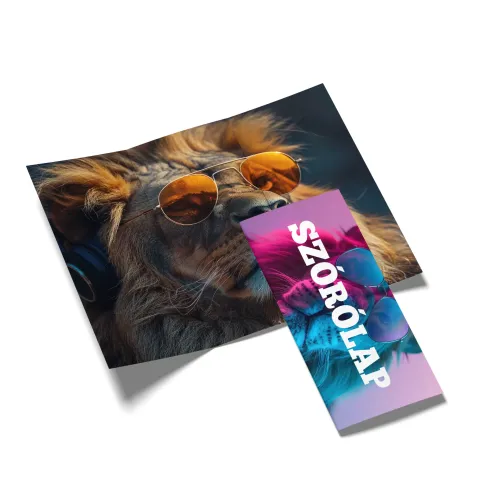
Perfect faces, glowing lights, flawlessly shiny objects and images that are impressive at first glance, yet somehow all look the same. Sound familiar? With some AI-generated graphics, we feel almost instantly: artificial intelligence made this.
But what makes an image "smell like AI"? What is this AI slop everyone keeps talking about, and how can you use artificial intelligence so that the end result is truly unique, authentic and even works well in print?
Here are seven practical tips!
What is AI slop?
The term AI slop is used for mass-produced, low-quality, often worthless AI content. It can be an image, a video, a text or even a whole website.
The phenomenon has become so widespread that the Merriam-Webster dictionary chose "slop" as its word of 2025.
The problem isn't artificial intelligence itself. It's much more about someone creating spectacular-looking content with a few clicks and then publishing it without any checking, rethinking or creative work.
The result is often an image that is technically rich in detail but has no real idea behind it.
An important difference: Not every graphic made with AI is AI slop. A carefully planned image created with the help of AI can be highly creative and professional. The difference comes mainly down to human decisions and post-processing.
Why do so many AI images look the same?
AI image generators try to produce a visually convincing result based on the instructions you give them. But if the request is too generic, you easily end up with solutions that already show up in countless other images.
Typical examples:
Overly smooth skin, perfect faces and unnatural smiles.
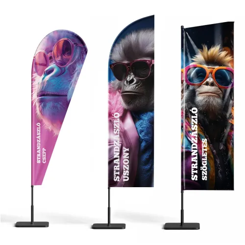
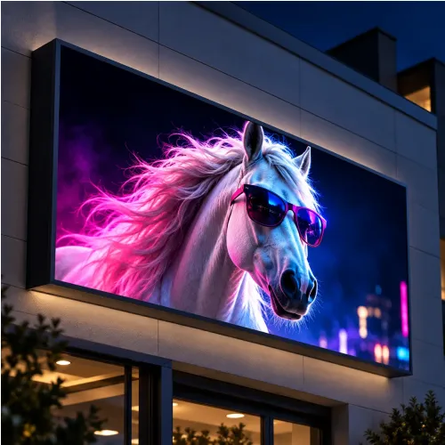
Strong, cinematic backlighting and objects that glow for no reason.
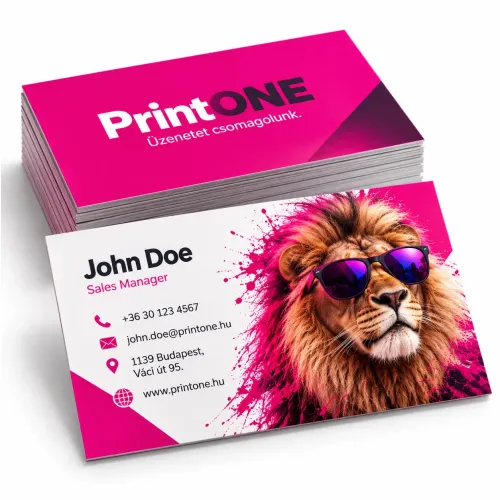
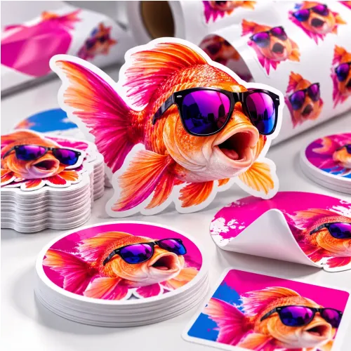
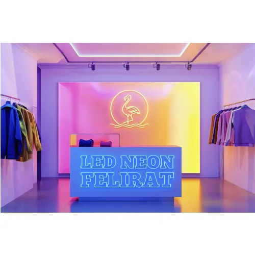
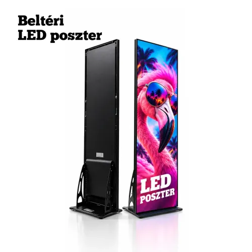
Oversaturated colors, sparkle everywhere and too many visual effects.
Cliché business scenes with unrealistically happy colleagues.
Overcrowded compositions where everything tries to grab attention at once.
Small visual glitches, strange lettering or inconsistent details.
None of these alone proves that an image was made with AI. But when several of these traits come together, you easily get that artificial, "AI-smelling" overall impression.
1. Don't ask for a nice image, have a concrete idea!
One of the most common mistakes is starting image generation with a prompt that is too generic.
For example:
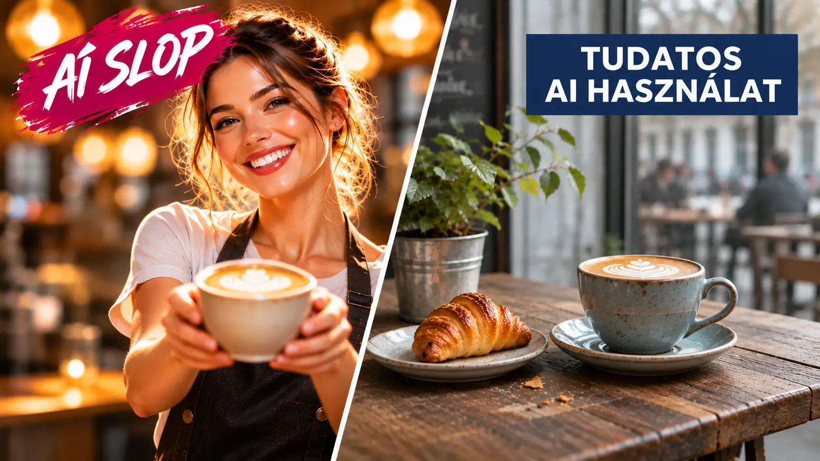
"Create a modern, spectacular ad image for a café!"
This can easily produce a pretty but completely characterless image: a perfect cappuccino, golden sunbeams, a smiling barista and a spotless café.
Instead, try to describe a specific scene:
"The morning mood of a small café in Budapest. An old wooden table with a half-finished cappuccino on it and a crumpled newspaper beside it. Through the window you can see the rainy street. Natural, subdued light, documentary photo feel."
The second version already has a story, character and atmosphere.
Tip: Before generating an image, put into one sentence what you want the viewer to feel or understand. Let that be your starting point, not a list of spectacular effects.
2. Dare to be imperfect!
The real world isn't sterile. Objects get worn, surfaces get scuffed, people's faces aren't completely symmetrical, and the light is rarely perfect.
It's exactly these little details that make an image believable.
In a restaurant ad, for example, a slightly crumpled napkin, a few crumbs on the table or a genuinely used kitchen can feel far more natural than a completely flawless, studio-like scene.
Not every image has to be photorealistic. An illustration, a collage or a deliberately stylized graphic can be great too. What matters is that the visual world is the result of a conscious decision.
Tip: Experiment with natural textures, asymmetric compositions, subdued lighting and less-than-perfect settings.
3. Don't let AI design the whole graphic for you!
An AI image generator is excellent for creating backgrounds, illustrations, special scenes or striking visual elements.
But an advertising graphic is much more than that.
The right typography, the hierarchy of the texts, the use of brand colors, the placement of the logo and the size at which the final result will appear all matter.
It's worth planning these separately.
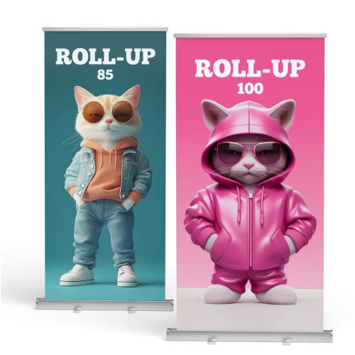
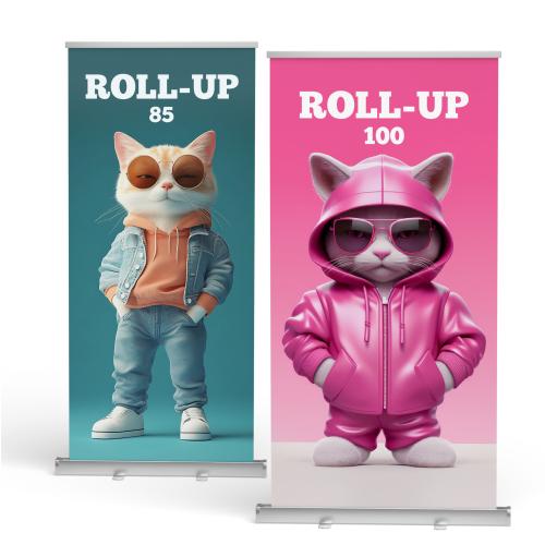
For example, with a Roll-up, AI can create the main visual, but it's best to place the headline, the logo, the contact details and the QR code in a graphic design editor.
That way the texts will definitely be accurate, and the whole composition is also easier to modify.
Tip: Think of AI as an illustrator or a photographer's assistant, not as a tool that automatically hands you a finished ad.
4. Use your own photos and brand elements!
If you want truly unique graphics, one of the easiest methods is to start from your own materials.
Your own product photo, shop interior, photos of your colleagues or a distinctive location can make the end result much more personal.
With the help of AI, you can create new backgrounds, environments or creative extras for them.
For example, you can place a real product photo in a spectacular, artificially created environment, while the product itself appears exactly as the customer will receive it.
Tip: With product ads, pay special attention to making sure the AI doesn't change the product's shape, proportions, packaging or important details. A spectacular but inaccurate product image can be misleading.
5. Don't just use the first result!
Image generation doesn't necessarily end with the first finished image.
In many cases, this is exactly where the real creative work begins.
Take a close look at the generated graphic. What works? What's distracting? Which detail should be changed?
Maybe the composition is good, but there's too much detail in the background. Or the mood is right, but the main subject needs more room.
Create variations, and change the viewpoint, the lighting, the colors or the crop.
Tip: If you're making an advertising graphic, leave enough empty space for the lettering to be added later already at the generation stage. It's much easier to work this way than to look for room for the text afterwards.
6. Think about the final print size!
An AI image can look great on a monitor, but on a two-meter Roll-up it can behave quite differently.
The resolution of files produced by image generators isn't always sufficient for the planned print size.
On top of that, when enlarged, even tiny flaws that you didn't notice on screen can become conspicuous.
Before printing, check:
Does the image resolution suit the final size and the viewing distance?
Are there any strange details, distorted objects or faulty lettering?
Are the important elements far enough from the trim edges?
Do the colors and contrasts work well on the chosen print material?
Are the texts, logos and QR codes of adequate quality?
A small flyer and a large-format banner don't necessarily have the same resolution requirements. The required quality is determined by size and viewing distance together.
Tip: Don't just look at the whole image! Zoom into the important details at 100% view as well, and check whether further upscaling or retouching is needed.
7. Have your own visual style!
This may be the most important piece of advice.
If every time you only ask the AI to create something "modern, professional and spectacular", you'll easily end up back at the same cliché look.
A recognizable brand, however, needs its own character.
Think about which colors, fonts, imagery and mood you want to use consistently.
It can be minimalist, playful, retro, documentary or even surreal. It doesn't matter which style you choose, but that you apply it consciously and consistently.
Tip: Make a mood board from a few reference images and use it as a starting point for AI generation. That way you don't have to reinvent your brand's visual world every time you create a new image.
Graphics made with AI: when is it worth leaving it to a professional?
Artificial intelligence has opened up many creative possibilities that used to require serious photography, illustration work or expensive post-processing.
But just because anyone can generate a spectacular image today doesn't automatically mean you'll have good advertising graphics.
A graphic designer doesn't just make an image, but also plans the message, builds the composition, takes the brand identity into account, and makes sure the end result works on the chosen surface too.
This is especially important with large-format printed advertising materials, where mistakes can be much more noticeable.
If you already have an image made with AI but don't know how to turn it into print-ready graphics, we'll help you with that too through the graphic design service at PrintONE.
Summary: AI is a good tool, but the idea is still yours
The AI slop phenomenon clearly shows that a spectacular image alone is no longer enough.
Artificial intelligence can produce in a few seconds what used to take hours. But the creative idea, the unique perspective and conscious design shouldn't be left out of the process.
The goal isn't necessarily that nobody notices you used AI. It's that the end result is good graphics, regardless of what tools they were made with.
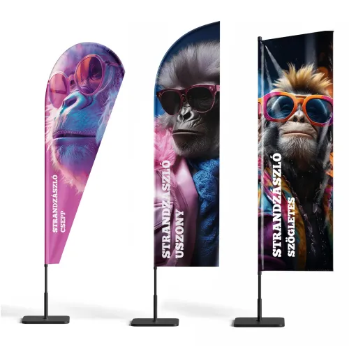
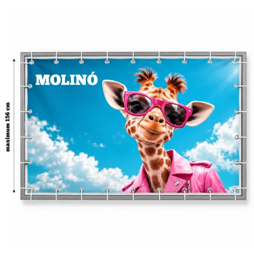
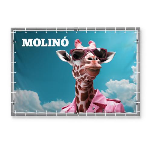
And if you want to turn your graphic into a Roll-up, a banner, a flag or another printed product, we'll help with the realization at PrintONE too.