 2026. October 28.
Beyond Templates – 5 Graphic Trends That Could Shape the Visual World of 2027
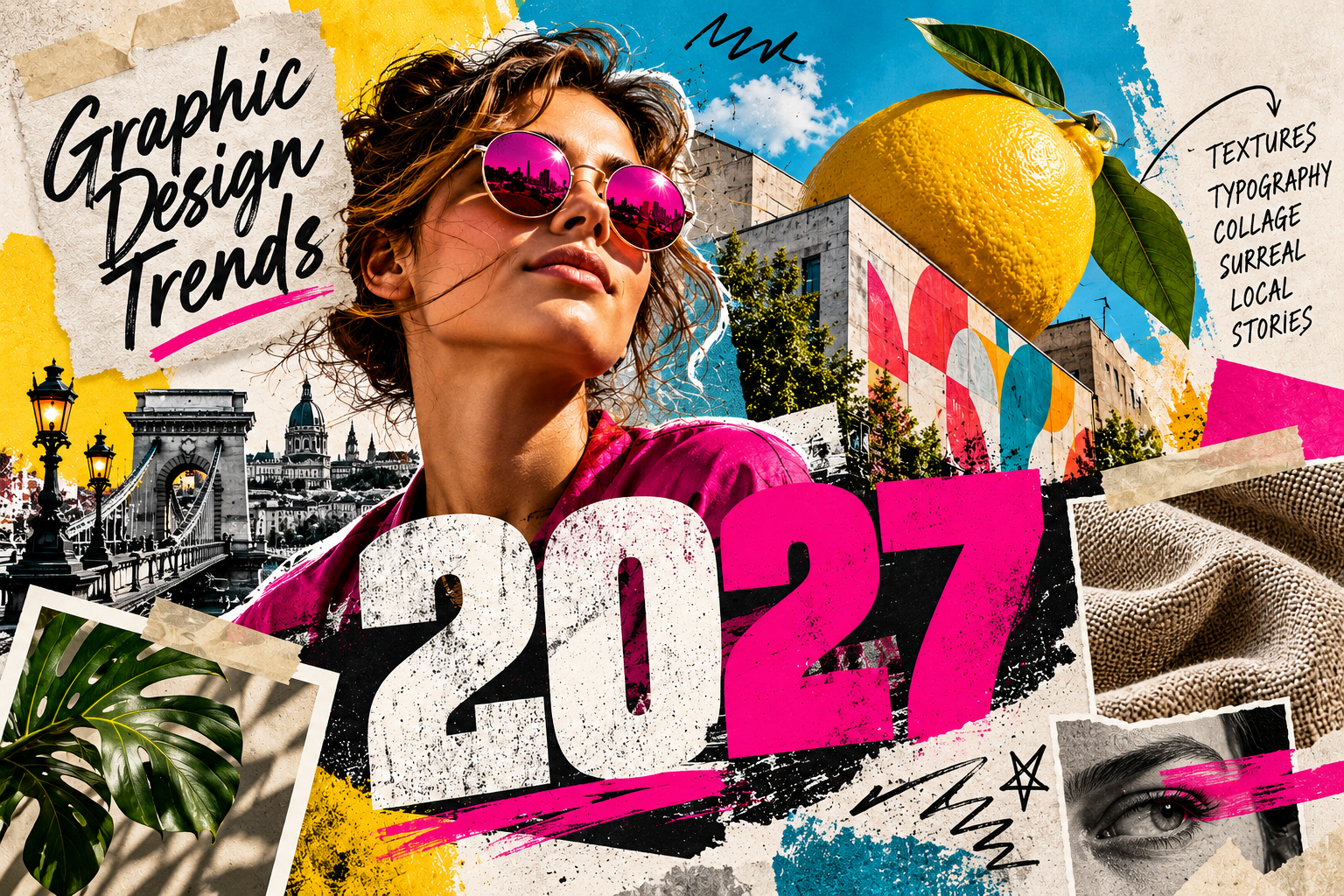
Alongside perfectly smooth surfaces, regular layouts and a sterile look, more and more space is going to graphic solutions with more character and a more personal touch. One of the most exciting questions of 2027 is how digital technology will meet tangible materials, unique letterforms and real stories.
In graphic design, the trends that are not only spectacular but also trigger emotions are expected to get even stronger. Natural textures, bold typography, surreal compositions and visual solutions drawing on local culture can all be important sources of inspiration.
But what do these trends mean in practice? And how can you use them in the promotional materials for your own business? We'll show you five exciting trends worth keeping an eye on in 2027.
1. Textures everywhere – when you can almost feel the surface
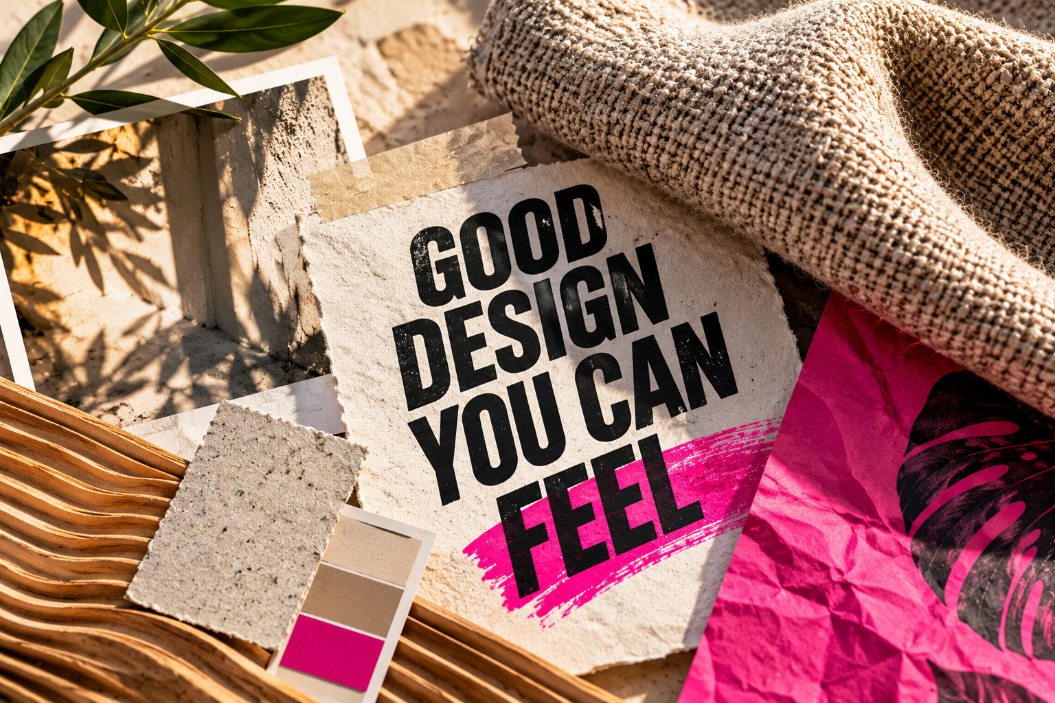
In the digital world, we come across loads of perfectly smooth, artificial-looking images every day. Perhaps that is exactly why natural, tactile surfaces are becoming more and more appealing.
Crumpled paper, rough canvas, woven textile, grainy cardboard or even a hand-painted wall. Textures like these give graphics depth and character, even if we only see them on a screen or a printed surface.
In 2027, the role of material feel is expected to grow even stronger, especially in visual solutions that emphasize the connection between the digital and physical worlds.
Proper lighting is especially important. The subtle shadows of a canvas lit from the side, for example, show the structure of the material far more vividly than a photo lit completely evenly.
How can you use it?
On the poster of a brand offering natural materials, the texture of recycled paper can work well. In a clothing brand's ad, a close-up photo of the fabric can highlight quality, while in the branding of a craft business, painted or drawn surfaces can create a more personal mood.
But make sure the texture doesn't overpower your message. What looks spectacular on a large poster is barely noticeable in a tiny social media image.
2. Collage and scrapbook – imperfection is cool again
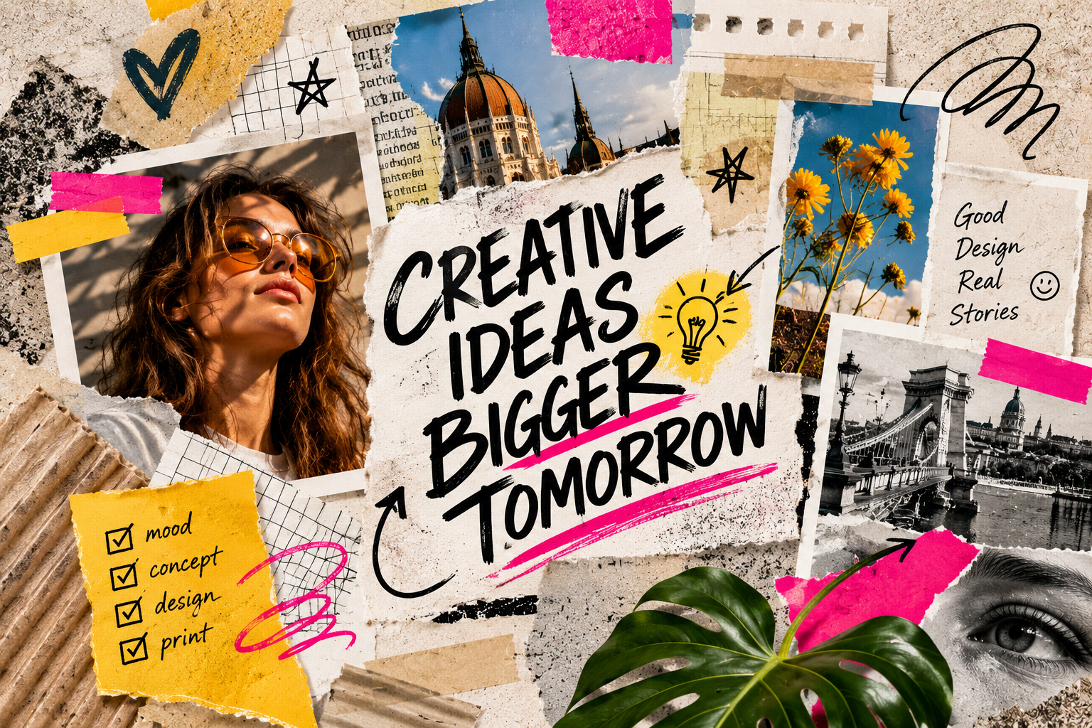
Pictures cut out of old magazines, adhesive tape, handwritten notes, torn paper edges and overlapping photos. The world of collage is popular again, but now enhanced by the possibilities of digital design.
This trend deliberately moves away from overly regular, template-like layouts. The graphic can give the impression that someone put the elements together by hand.
The collage technique is especially suited to storytelling. A handwritten word, a drawn arrow or a seemingly randomly placed photo can make the message more personal.
In 2027, the handmade effect can also be an interesting counterpoint to images produced by artificial intelligence. Deliberately irregular compositions can give brands a more unique, more human character.
Where does it work well?
On posters for cultural events and festivals
In the branding of youthful brands
On promotional materials for creative workshops and exhibitions
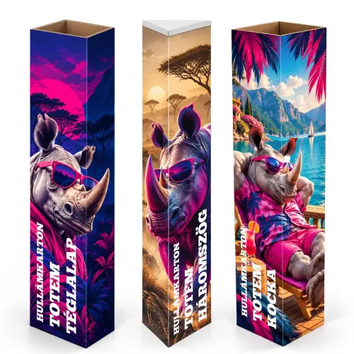
On custom packaging and promotional products
In social media campaigns
The secret is balance. The handmade effect must not turn into visual chaos. If every corner gets another piece of tape, scribble and scrap of paper, the main message can easily get lost.
A well-placed handwritten note is often worth more than ten decorative elements.
3. Giant letters, bold typography – when the text itself is the graphic
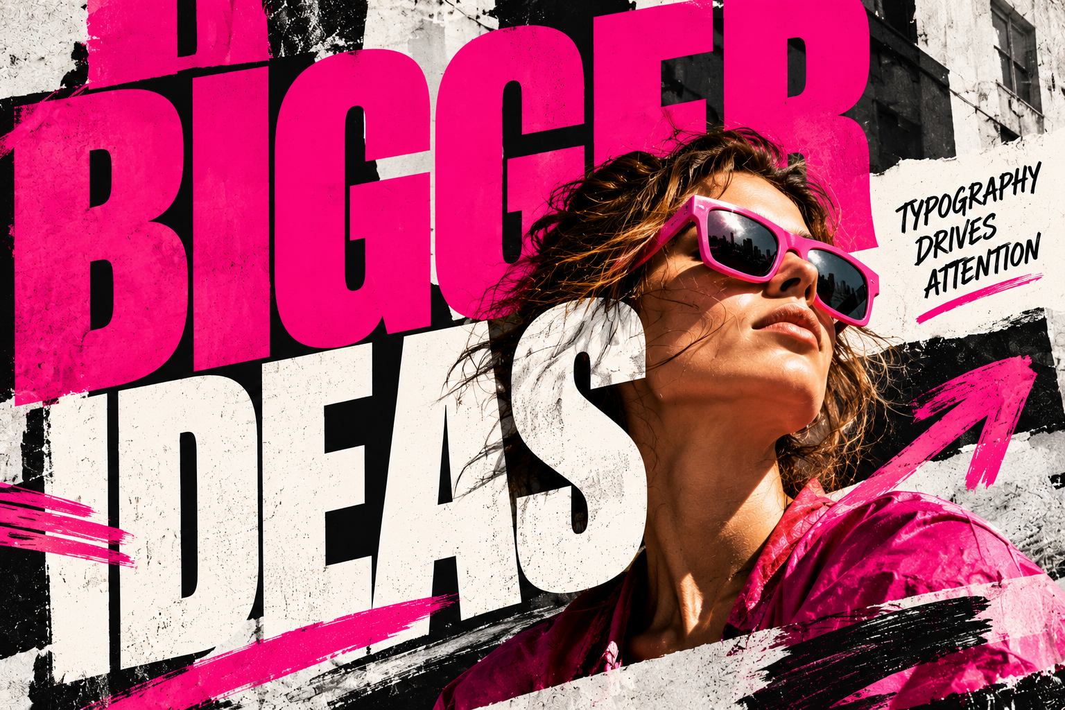
Among the graphic trends of 2027, expressive typography is expected to keep playing an important role. Letters no longer merely convey information, but become defining visual elements of the composition.
Huge headlines, letterforms with unusual proportions, distorted characters, playful handwriting and layered texts may appear in advertising.
A well-chosen typeface can be enough on its own to create an attention-grabbing graphic.
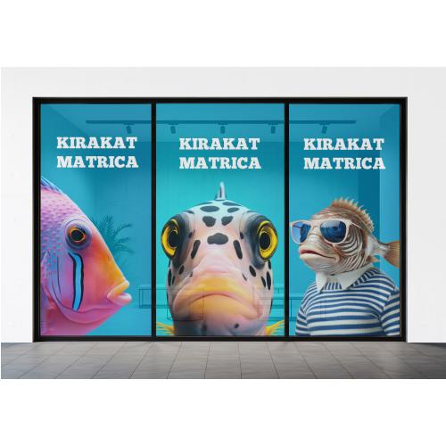
Imagine a concert poster where the performer's name almost fills the entire surface, while the background photo is only visible in fragments between the letters. Or a shop window display where a single huge word draws the attention of passers-by.
Why does this work especially well on printed promotional materials?
On a large banner, Roll-up or poster, typography is one of the most powerful attention-grabbing tools. Properly sized, high-contrast lettering is readable from afar, so the message can reach its target quickly.
However, it's important that alongside the spectacular headline, the practical information is also easy to find. On an event poster, for example, the typography can be fantastic, but it's no use if the date or the venue is barely readable.
Tip: Always check your graphic at the actual size it will be used. What looks good on a monitor can work quite differently on a banner viewed from a distance or on a phone screen.
4. Surreal images – when imagination takes control
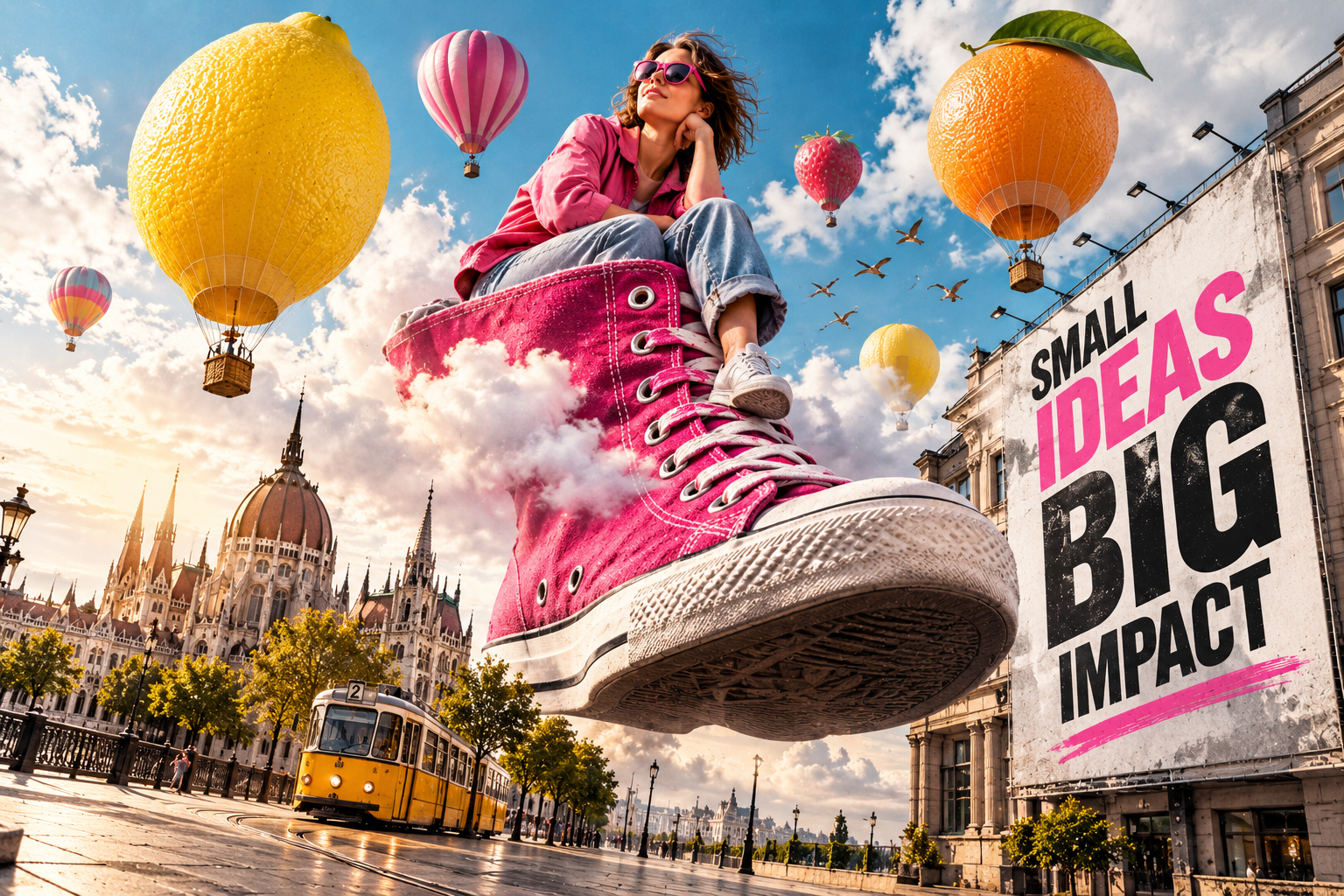
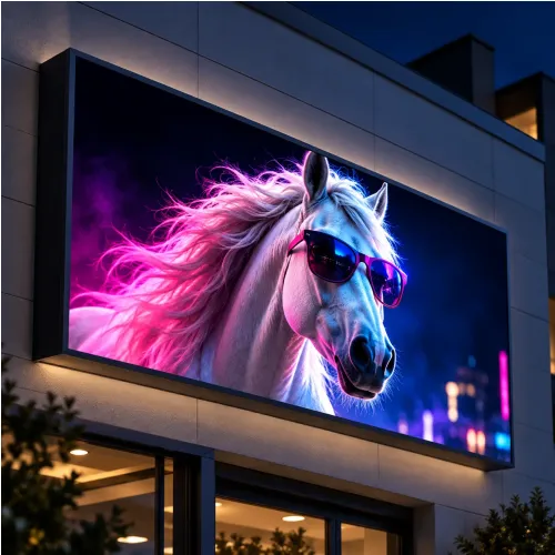
A giant piece of fruit in a city square, floating objects, impossible perspectives or proportions that defy reality. Surreal and hyperrealistic imagery can remain an exciting tool of advertising graphics in 2027.
These compositions are especially effective because they jolt the viewer out of the usual visual environment for a moment.
A huge lemon in a soft drink ad, for example, can instantly convey freshness and intense flavor. A giant sneaker on top of a building can spectacularly highlight the launch of a new product.
With the development of generative artificial intelligence, producing such images may become accessible to more and more businesses and graphic designers.
However, technology alone doesn't replace a good idea and a graphic mindset.
The lighting, shadows and perspective of the different image elements must be in harmony. If they don't fit together, the composition can easily become unconvincing.
Where is it worth using?
Surreal imagery can work especially well on large advertising surfaces, exhibition backdrops, shop window displays or campaigns where the primary goal is to capture attention.
However, this style doesn't suit every brand. With a restrained, premium identity, for example, it can easily be too much.
5. Local stories, real environment – authenticity gains value
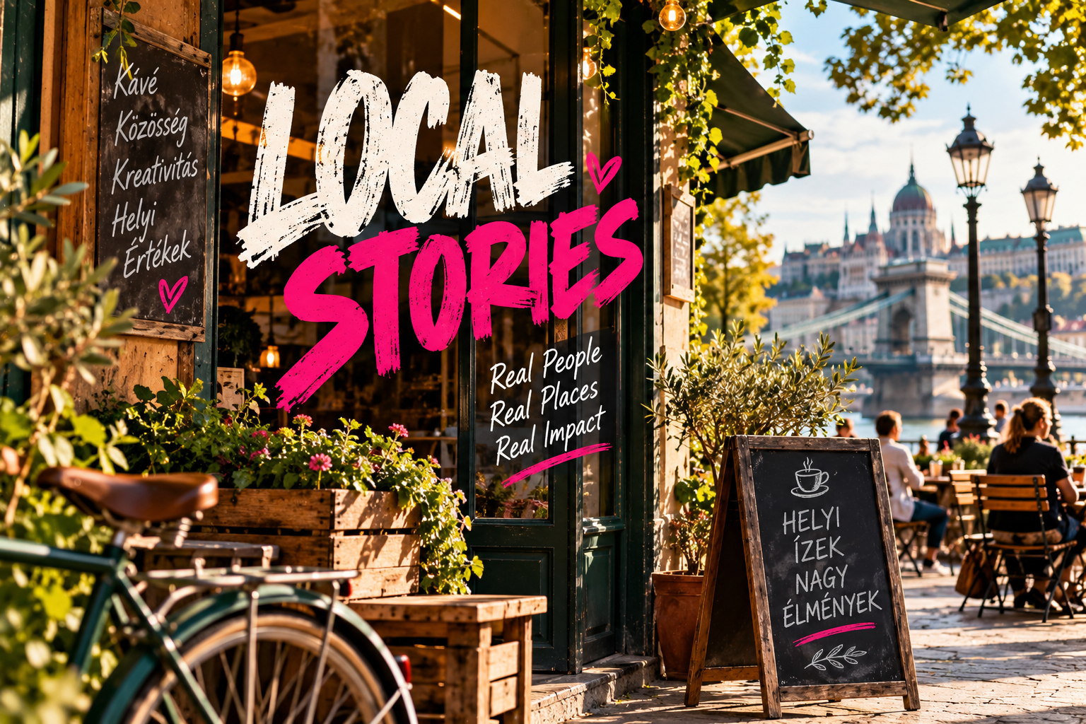
In the world of global stock photos, we often come across the same images. Smiling businesspeople at a conference table, perfectly furnished offices or urban scenes that could have been shot anywhere in the world.
In contrast, visual content showing real places, people and local characteristics can be worth more and more.
In 2027, visual communication built on authentic, local stories can be especially interesting for businesses that want to stand out from template-style advertising.
In the ad of a Budapest café, for example, your own photo of a characteristic street in the neighborhood can be much more personal than a generic image of a foreign café.
The same goes for businesses' introductory materials. A photo of a real workshop, shop or work process often conveys the brand's values more authentically than a perfectly retouched but impersonal stock photo.
What does this mean when designing promotional materials?
It's worth drawing on your own business's environment, history and everyday life. Shop decoration, a company banner or an exhibition backdrop can grab attention even if it works not with special effects but with a well-captured, real moment.
Authenticity doesn't necessarily mean that every image has to be spontaneous. A carefully composed, professional photo can also be natural and personal.
How to use the 2027 graphic trends in your own promotional materials?
New graphic trends are inspiring, but it's not worth building every fashionable solution into a single design at once.
Good advertising graphics don't work because of how many current trends appear in them, but because of how effectively they convey your message.
Before you start designing, think it through:
Who is the graphic for? A completely different visual solution may appeal to a young festival crowd than to the attendees of a business conference.
Where will it appear? A social media post, a business card and a six-meter banner require different design considerations.
From what distance will it be viewed? Detailed textures can work well up close, but they can get lost from a distance.
What is the most important message? Spectacular graphics are successful if the information also stays easy to understand.
It's worth trying out several versions, too. The same graphic with different typography, background or imagery can create a completely different effect.
Trends change, the principles of good design remain
2027 may offer new opportunities in creative visual communication. Natural textures, bold letters, collages, surreal images and authentic local stories can all help a brand appear with more character.
However, the foundations of well-working design remain unchanged: a clear message, proper contrast, a well-thought-out composition and solutions that fit the environment of use.
At PrintONE, we help make sure your idea becomes not only a spectacular graphic, but also a high-quality printed product that fits its purpose.
Whether you want a Roll-up with bold typography, a special banner, a custom poster or complete event decoration, we'll help you find the right production solution.
Already have a finished graphic? Upload it with your order! And if you only have the idea so far, our graphic design service will help you with the realization too.
PrintONE – We package messages.