




 2026. August 04.
Typography: the invisible hero of visual communication
Why does typography matter?
Typography is more than picking typefaces – it's the visual language that shapes how we understand and feel a text. The right letterform can build trust, reinforce a professional impression, or suggest playfulness. If you choose badly, even a great message can easily get lost or fail to have the effect you want.
Typeface as a message
Different typefaces have their own character. Serif fonts feel classic, elegant and reliable, which is why they're so popular in book publishing and with premium brands. Sans-serif fonts, on the other hand, are modern and clean, and you often see them at tech companies or startups. A lesser-known fact is that typography doesn't just express a brand's personality, it can also adapt to the habits of your target audience. For example, a young, dynamic audience may resonate much more with a slightly more playful, "friendlier" typeface than with a formal-looking serif.
Readability: where form meets function
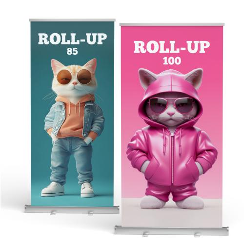
One of typography's key roles is ensuring readability. It matters what font size, line spacing and line distance you use. On a flyer or a Roll-up, for example, the most important information has to be instantly understandable from a distance. Here's an interesting point that gets mentioned less: our reading habits are changing too. In print, we'll follow even longer texts all the way through, while with online content, quick skimming is typical. That's why shorter line lengths and larger font sizes are recommended on digital platforms.
The mood and rhythm of typography
A typeface doesn't just carry information, it also creates a mood. A script font reminiscent of handwriting can suggest a personal, friendly feel, while a thick, robust typeface suggests strength and determination. Rhythm matters too: if headings, subheadings and body text get a different typographic hierarchy, readers can easily find their way around the content. But if everything appears in the same form, the information "blends together".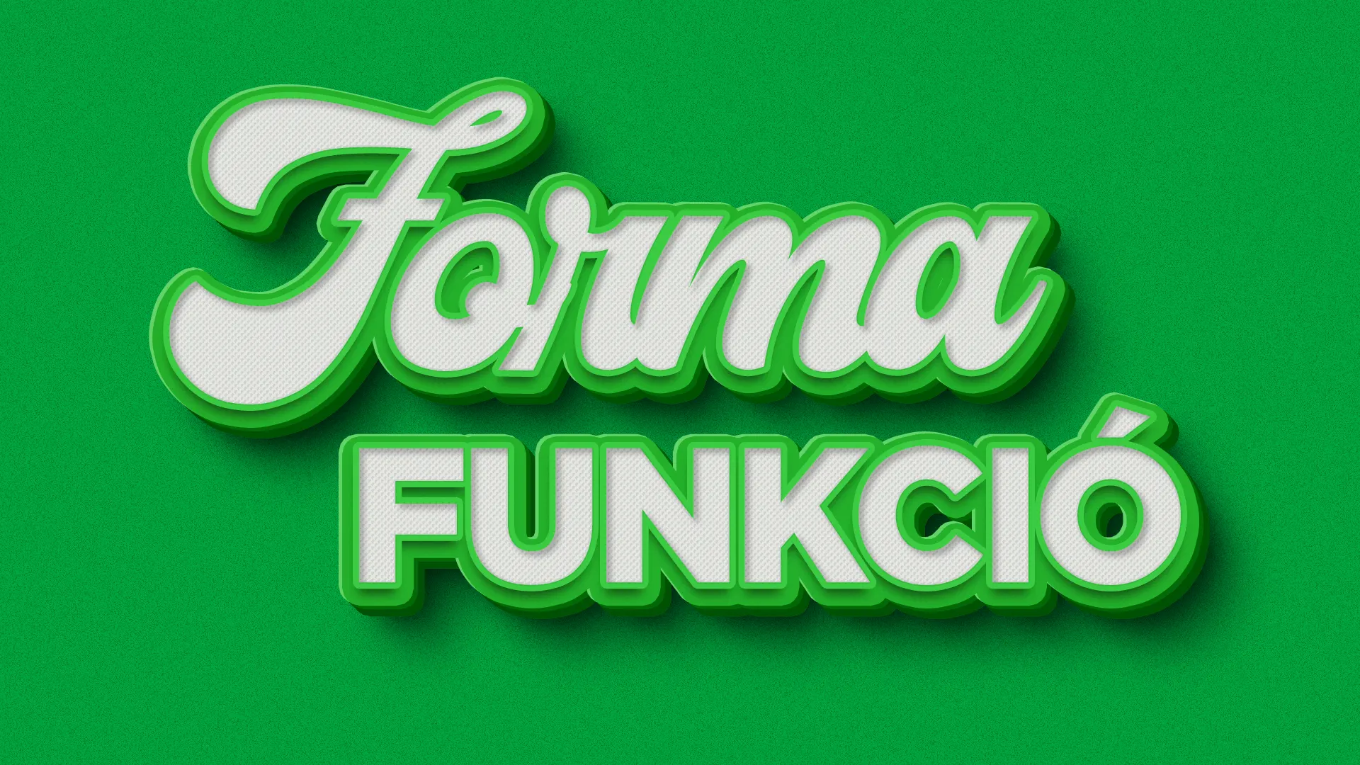
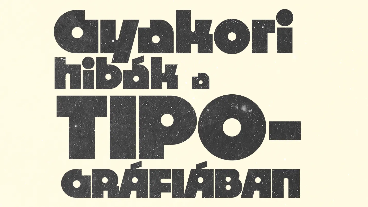
Common typography mistakes
Using too many typefaces: two, or three at most, well-matched fonts are plenty.
Lack of contrast: light text on a light background, or a size that's too small – these make it harder to take in.
Poor pairing: some typefaces just don't harmonize together, so the end result looks messy.
Typography at PrintONE
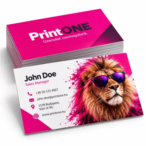
Typography is especially important for printed materials, since every detail becomes visible on paper. At PrintONE, we make sure during the design process that your text isn't just aesthetic but also works well functionally. That way we make sure brochures, banners, Roll-ups or even business cards all make a professional impression.
Closing thoughts
Typography is the invisible hero that holds visual communication together. If you choose your typefaces, sizes and layout consciously, your message doesn't just reach your target audience, it also makes an impact on them.